Apr 30, 2015

... and we have envelopes!

Here is the Lemon & Pepper envelope. We didn't really do many concepts/ideas for the envelope because we basically based it off the letterhead and tried to keep it the same style. 

We kept the yellow bar on the top and also the flap for the envelope. We used the main logo here on the back of the envelope because there is enough space for us to have the bigger version and still for the text to be readable. 

The front just contains our contact information, with a space reserved for our stamp.


Letterheads Complete!

Another one down!

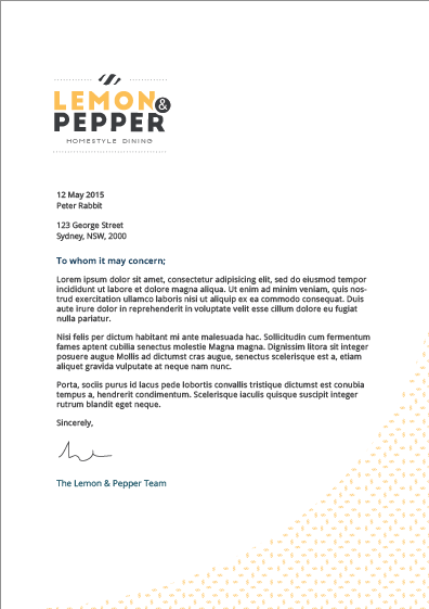
After some refinements from the initial letterhead designs and making the changes that were mentioned, we looked through the refinements and we were quite happy with some of the concepts as the secondary logo really looked a lot better on the letterhead.

We added a yellow bar which brings out our identity. If our document was sitting on the table we want people to be able to identify that it's a Lemon & Pepper document straight away and we believe that having the yellow bar on the top will help that. Also, as said before, having the lemon and the dotted lines at the end of every text passage. Here is our final letterhead design.


The first page will be the first/cover page of any Lemon & Pepper document. The second page will be for all subsequent pages of any Lemon & Pepper document. 

Envelopes

We are also close to finishing our envelopes! Basically basing that off the design of the letterhead so everything looks in sync. 

Apr 28, 2015

Stamp of approval!

Here is a mock up of one of the stamps that we will have, we decided to have a stamp with just the lemon on it for the loyalty cards when we stamp on it. We also wanted to have a stamp with our main logo on it for our business.

Here's just a mock up of what the stamp would look like!


Changing our Deliverables

After some discussion with our lecturer we took a step back and realised some of the things that were on our deliverables list weren't actually needed. I guess it was because when we were writing our list of deliverables we still didn't have a solid style/feel so we kind of just thought of as much as we could possibly make and put it down. We made two changes!

One - Placemats

So in our deliverables list, we had placemats as part of our packaging for dine in. But after we had established our style we realised that with the style of restaurant we have, there usually aren't any placemats. Since when was the last time we went to a hipster restaurant with placemats? So we decided to cut that out.

Two - Location/Interior Mock Ups

Initially we had the mock ups as a highly desirable, but after some discussion with our lecturer it was brought to our attention that it was important to have mock ups of how our packaging material (cups, boxes) will sit on our tables and what it will all look like, including the type of furniture we will have and what it will look like inside. That alone can give someone a clear impression of our brand so we decided to move that up into our list of deliverables. 

This will involve us taking photos of our products and using photoshop to mock them up into a setting that we want. 

Business card changes!

We are making changes to our business card! Only a minor one though!

So after doing some concepts for the letterhead, it led us to make changes for our business card. Since we decided that we will have the lemon with the dotted lines on the bottom of all the pages for the letterhead (in a document), and we only have just the lemon on the bottom of our business card (back side) we thought we would make them the same between all the different stationery elements.

So our old business card, which is...


Will now be...


We feel that keeping that element the same between all our materials will bring continuity and flow within the whole brand.

Working hard or hardly working?

We've finally settled in to the flow of things and starting to develop the natural feel that you get when you've been working on a project for long enough. We navigated past the first few major hurdles and now it's just a matter of nailing things down and applying what we've established into everything that we do. We started work on some letterheads and mock ups of stationery.


Here are just a few of the letterhead concepts that Jaz had come up with, this is only the cover page. We will also be doing some concepts for the subsequent pages of a document. We had mixed thoughts as some of us liked some aspects and others didn't. But we all agreed that we should try using the secondary logo instead of the main logo for the letterhead and envelope. Also maybe adding a bar of colour on either the top or bottom of the page. 

As said before, since we have our basics down like our logo. We can start tackling a lot of the stationery design work simultaneously. As Jaz is working on the letterheads and envelopes, Delvin has started doing work on the loyalty cards. Here are are of the loyalty card ideas, they are really rough!


Also for things like stamps and stickers, it would just be our logo so it wouldn't be that difficult to create.

Budget

Dut was tasked with the responsibility to start on the budget as we needed to know a rough estimate of how much it will cost us to produce everything that we wish for this project. It is nearly complete, but it's only really rough and nothing is final. Over the course of the project places and prices that we source might change and even our deliverables that we choose to produce might change. This will be just a rough guide.

Apr 26, 2015

Brand Patterns & Secondary Elements

Through the designing of our logo and business cards we have created a few little elements that are part of our brand, they serve as secondary elements that compliment our design and ultimately the overall look and feel of Lemon & Pepper.

Pattern

The first of them is our pattern,


These patterns were evident in the business card. Patterns are great to work with and offers something extra in designing our materials. Here we have two different variations, the yellow or the charcoal that we have. The pattern consists of many little lemons. They aren't mean to be obvious, more of a subtle touch to our designing. 

Lemon

This is the 'Lemon & Pepper' lemon on it's own,


This secondary element also comes in both of our primary colours. This would be used as a stamp or as a form of identification of our brand. 

Lemon with Dotted Lines


This is another variant of the lemon, except this time it is coupled with the dotted lines. This is also evident in the business card. This variant would be used on print material, we would like to create a style where this would be at the end of any passage of text? For instance at the bottom of each page of the menu after all the text. 

A Secondary Logo/Logo variations

Secondary Logo

After we designed our logo, we took into consideration the elements that are in to logo and how they will be affected when the logo is resized to a much smaller version, for lets say the letterhead, website or loyalty cards. So we decided to create a secondary logo used when the main logo gets too small for some elements to be seen.

Here's the secondary Lemon & Pepper logo,


As you can see, compared to our original logo we've basically taken out all the elements except for our restaurant name. This makes it more horizontally oriented as opposed to the original one.

Logo Variations

This wasn't addressed before as it should have been but in our Lemon & Pepper logo suite we have (as seen from above) a main logo and a secondary logo. For each of them we have different variations in terms of colours.

For each of the main and secondary versions there will be a yellow variation,

Main Logo


Secondary Logo


The yellow logos are to be used only on backgrounds with the charcoal colour from our colour palette. (This will be a rule that is set in our style guide). That is why the stroke around the circle is of that charcoal colour. 

Other than that we will obviously have the standard black and white versions of each logo. But we probably won't be using them in any of our branding. 

Apr 23, 2015

What about the website?!

With all this work being done with print design we can't forget about our website. Jeanel has been working on wireframes for our website and so far this is what we have,.


So this is what we have so far. Obviously a lot of changes need to be made, but this is the first rough wireframe we have. We want to go for an infinite scroll site and these are the 5 pages that we want to have. Most of the pages are self explanatory. For the gallery it basically for images of our restaurant or food based off an Instagram hashtag. As we know that nowadays Instagram is really popular coupled with the fact that a lot of people love taking photos of their food and posting them online. we decided to integrate the feed into our website so it will be showcasing the food that people are eating from our restaurant. 

But the layout and images chosen are definitely really cool and suits what we are going for. It's clean and the images give off that homestyle feel which is what we are, "homestyle dining". 

What defines us?

Over the last few weeks, especially while designing the business card, the problem we had with our first versions of designs was that it wasn't exactly the style that we wanted so it was recommended that we give ourselves 3 words that define us. 3 clear words that we would look back to with every design that we make and use it as a guidance tool. With these 3 words it'll make designing our things a lot easier as we have these words to go along with. These 3 words can also be some sort of a brand personality for us.

The three words that will define Lemon & Pepper are;

Clean

Fresh

Trendy

Stationery

Today we made a start on the stationery of our brand. To start it off we began to design business cards. After a few days we came together and shared what we had done.


We really liked the concepts that we had come up with and now the direction of our work seems a lot clearer. After working on these concepts we let our lecturer have a look at them and give us some feedback on what we've done. Our attention was brought to the fact that some of the designs were too busy and cluttered and it wasn't as clean as we first wanted it to be so we had to change a few things. Originally we were going to go for the charcoal background and yellow text as we thought that looked better and it suited in with the trendy look but it seemed to dark and harder to read so it was better to have it on white as it would be easier on the eye. 

We wanted to go for a portrait business card as it was something different from what we've done in the past. We've always designed business cards in landscape and having it in portrait would be cool and it looks pretty good as well!

After some refinements, we changed the typefaces on the back of the card and made the headings 'Big John' rather than using 'Open Sans' for everything and this was our final business card!

We are now starting with the loyalty cards and letterheads, progress has been made on the wireframes for the websites and style guide as well. Everything seems to be going well and on track. Team spirit is definitely on a high! 


Typeface changes

Typeface changes

As stated before we had all our typefaces sorted, 

1) The Logo 

- Big John/Slim Joe
- Arial

2) Headings

- Iskra

3) Body

- Adelle Sans


But since we created our logo we realised that the typefaces used in the logo didn't really go well with the typefaces we had already chosen for the headings and body text. So we decided to change things a little bit to make our typefaces seem more connected and fluent. 

We decided to change the body text to;

Open Sans

...and for headings we will be using Big John/Slim Joe so there is a consistency. 

So our final two typefaces will be, Big John/Slim Joe for the logo and headings and Open Sans for body copy.


Apr 22, 2015

Logo Disaster comes to an end!

By this time we were in serious trouble with our logo. We were about a week behind the projected timeline. At this point in time we were supposed to have a final logo completed and beginning work on the stationery and the wireframes for the website, but instead we are still very far from having any sort of logo.

So we asked for some help from one of our lecturers. He took a look at our mood board that was shown in one of the previous posts and the feedback was that he saw two different styles in our mood board, that we only just put in a bunch of things that we like into it but we didn’t actually think about a specific style (which is what a mood board is supposed to be for). There were two clear feels/styles that were evident in our mood board:

1. Clean/Minimalistic
2. Cliché/Trendy Hipster

It was suggested that we split our group into two and two of us would explore an idea each, by doing mock ups. So after that we can come together as a group and show what we’ve all done to see what we like or dislike from each different style and that will give us a clearer path ahead as to what look we are actually going for.

We were given some great advice and it kind of rejuvenated us, knowing that there will be an end to this process and we can get somewhere and actually get this logo sorted!

So after about a week, we came back together and this was what we had:

Clean 


Trendy

After going through our second round of concepts, we were still undecided on which style to go for, clean or cliché. But we knew we would have to choose out of one of them, at least it wasn’t out of a million different choices! After a few refinements and eliminations we came down to two last logos, one from each of the styles.


All four of us liked both logos and were happy going with either style for the rest of our project. Since we are so indecisive and it would have taken forever if it was up to us. We asked our
lecturer again which one was better, which one would be better to work with in the long run and the options we could have with it. After going through them both our lecturer basically said they still don’t really work and need improvement. So he took the logo from the cliché style, changed it up and tried a few different concepts. In about 5 minutes he came up with something that looked better than what we managed to do in the last two weeks!! We really liked his idea, although it wasn’t completely finished or how we would have liked it. We took it and played around with it, made some minor changes and with that we came up with a few variations.


We tried the "&" with a few different typefaces...

From these refined versions we finally made a choice on the logo! About time! We chose the one with the “&” to the side. We felt that that made the logo a little bit trendy and playful since everything in the logo is really centered, so we had the “&” to the side instead of being in the middle.

So with that we killed two bird with one stone! We have our final logo,


…and we also have a typeface for our logo now! The typeface we will be using for our logo is called ‘Big John & Slim Joe’. They are actually separate typefaces but they are the exact same just different weights. For the "&" the typeface is Arial.


So now we have our logo sorted, typefaces all sorted, we are ready to move on and start designing the stationery!

Apr 16, 2015

Logo Struggles

It has come the time that we actually put our designing skills to good use. After all the planning and foundation work, we are finally starting to do some design and first off was our logo. At this point we still haven't found a typeface for our logo so we decided that we would create the logo and try different typefaces at the same time, it was just trial and error basically.

As a team we came up with many concepts for our logos, here are some of them.


This was our first round of logo concepts. We tried to go for the "hipster" look with the shapes, patterns, banners and ribbons. But we didn't like any of it. Nothing stood out yelling "pick me!". We spent a lot of time refining some of these but just nothing seemed to be going well.


At this point in time we were frustrated and down in morale.

We played with a bunch of typefaces and still nothing really stood out and we were beginning to think maybe we shouldn't close ourselves off to just cursive typefaces and be open to others as well. At this point we didn't know what we were doing and everything just wasn't going to plan.

Anyways! Got to keep looking up!

What are we going to look like?

Before any project, we need to have a mood board on what the tone of our restaurant would be. The look and feel of our brand and the overall setting of our restaurant. We did mention earlier that our restaurant would be gearing towards the vintage/rustic look. Our restaurant furniture would be made from natural materials such as timber.

Imagine brick walls, chalkboards, textured surfaces and darker colours. Here is the final mood board that we have decided on. We did have a bigger mood board before, but we culled a lot off to have a more precise direction.


So with the mood set, we needed to get more specific with our tone. What will our colour palette be? What typefaces are we using?

Colour Palette

We came up with a bunch of different colour palettes to begin with, after a group discussion we narrowed the colour palettes down to final three.


From these three colour palettes we ended up choosing the middle one.


This is our final colour palette. We think it will work really well with what we want and what we are going towards. We wanted to be trendy but at the same time do something a little different from the cliche hipster stuff. We believe this colour palette will help us do that. We can use the charcoal and yellow as our main colours, as they both represent our name 'Lemon & Pepper' plus the two colours sit really well together. This colour combination can also represent the "hipster" aspect of our restaurant as nowadays the trend is a dark colour with bright accents. The remaining colours we will use as secondary colours and be used as and where it suits. They aren't the typical hipster colours so that highlights the fact that we aren't trying to be fully cliche. 

We also had an idea that for the packaging for different foods we can use the different colours as colour codes for different sorts of food. 

Typography

We had difficulty with typography as it took us a long time to settle for something and even after settling for a typeface we still weren't totally sold on the idea. This process definitely took long er than expected. 

At first we decided to have 3 different typefaces:
1. Logo Typeface
2. Headings Typeface
3. Body Typeface

For the logo typeface we wanted to go for something handwritten or "semi cursive". But of all the ones we found online they just didn't work. We spent a long time but nothing stood out to us. Honestly we were a little sick of it so we stopped looking for logo typefaces for now. 

For the heading and body typefaces, we also had many choices and in the end we tentatively settled for these two typefaces:

For Headings: Iskra


This typeface has many weights so it gives us many options for headings. We can have thick and heavy headings or really fine and clean headings. This was also available for both print and web.

For Body: Adelle Sans


We chose this as the body typeface because it was really nice and easy to read. Pleasant on the eye when in big paragraphs. Also it has a few weights to work with in case we needed it. 


A lot of work was covered over the last few days, although we feel like we've gotten no where still and it's all been a tiring and frustrating process. 

Apr 13, 2015

What are we making? - Deliverables

Like every other project in university, we need a list of deliverables. Things that we will have made/created and presented at the end of it all. 

As mentioned in a previous post, we were going to create everything that has to do with this restaurant. More specifically we will be focusing a lot on packaging this time around. 


Here is the detailed and final list of deliverables that we have decided on for this project. It seems like a long list and it may look like we've bitten off more than we can chew. But the reason we chose to do these things was because we believe in the ability of our group and what we can achieve, that's why we thought this was an appropriate amount of work plus it gives us a challenge as well. Plus once we have the foundation set in stone, the rest will just flow along and it's just a matter of changing and modifying different things.